Animation Sketchbook

I found myself falling back a lot on my fine arts training for the sketchbook project. Without thinking about it I chose to draw almost exclusively from life, something that was always stressed in my drawing classes, and in graphite, my medium of choice for undergrad. I’ve excluded all the project sketches and notes from this collection, as I wasn’t making them with this exercise in mind.

I didn’t enter this assignment with any real plan, except to draw what struck my fancy on any given day. Looking at all the drawings together it’s easy to see them as a record of where I spent my time. There are several drawings of the kitchen table, wine bottles and glasses, and home interiors. It’s probably not surprising that there’s a view of water towers from my office or a lot of plants in my apartment.

I enjoyed this assignment, but I did have trouble remembering to do the drawings every day. I would often find myself doing them in twos and threes as I was making up for missed days.


After Effects Animation

Viniyata and I partnered up again for the second animation assignment. We ran through a number of ideas for this project, from a riff on the little mermaid to a hypnotic pocket watch pendulum. Eventually we settled on something using DaVinci’s Vitruvian Man. The drawing seemed like a good way to explore animating the human form, without having to invent a character. It also allowed us to explore shapes and patterns, which seemed pretty cool.

We storyboarded out the idea, then divided the work into two parts: prepping and animating the Vitruvian Man himself and then duplicating and animating the original animation. I took animating the Vitruvian Man, who I eventually grew really really tired of.

Cutting up the Vitruvian Man into parts was straightforward, but tedious. I thought of him like a paper doll. I spent quite a bit of time duplicating layers to separate each arm, fore arm, and upper arm into three distinct pieces. It was the same process for each thigh, calf, and foot. After cutting everything up in Photoshop, I took everything into After Effects to test it out. The figure needed a lot of adjustments, and that also took a fair amount of time.

Something that we hadn’t considered when we first picked the Vitruvian Man is that only one of his legs can really bend, due to how they are positioned in space. I solved this by mirroring the leg that can bend. This looks a little silly, but you can’t really tell in the animation.

Vitruvian Man Legs


I created the figure’s animation by with rotations and parent/child pairings. I was trying to keep the motions angular and ‘mathematical’, but also make them seem human. I think that works. After finishing the figure animation I handed the composition off to Viniyata.

Stop Motion Animation

When Viniyata and I met to shoot our animation, it became clear that our original idea was not feasible to shoot on the floor. So, we quickly reconsidered what the strengths of our idea were and considered what we could do with them. We realized that we had not one, but two charismatic little monsters. We also had the fact that we were learning stop motion animation.

We decided to combine those two facts and create an animation about the animation process. The sequence would include us setting up the stage, adjusting the camera, and beginning to animate the first monster. Then, the second, larger monster would eat the first, as new ideas consuming the old. Finally, the larger monster would lunge at the camera, turning on its creators.

This was a lot of fun to shoot, even though we had a couple of problems. The little monster was not designed to bear any weight, to having him old things mean that his arms would slowly move as we were shooting. Also, the large monster wasn’t designed to walk, so making that animation was tricky. However, in the end I think the animation was pretty successful.

Stop Motion Animation Monster Build

Monster Headshot

I built a bigger better monster based on our clay sketch. I built him from 16 and 22 gauge armature wire, gaffers tape, clay, and other miscellaneous items I found in my apartment. The idea was to put a gaffers tape skin over the armature, and then cover it in clay. That way the monster would be lighter and have a good range of motion. Also, the monster’s feed and torso were weighted with sand and rocks to give more stability.

After blocking out the animation it became clear that the monster needed feet, so I added them after the fact. During the animation process I realized that I should have also given the monster knees.

ICM Final – The Beautiful Game

Screen Shot 2015-12-09 at 3.27.09 PM


See it Live

Code

Concept

I knew right away that I wanted to do a data visualization for my ICM final, mostly as a technical challenge, but I had a hard time coming up with a topic that was meaningful to me. Dano suggested that I spend some time thinking about a question that I wanted to ask, and use that as a way to frame the project. I sat with that for a while and found myself thinking about why I liked data visualization at all. I realized that I’m curious about how good visualizations can reveal not just what we know, but how we know.

In the US right now Wikipedia is treated like the repository of human knowledge, when in reality it’s far from it. When we check Wikipedia what we see is just a momentary record of the activity of adding, editing, and deleting information by contributors. It’s more of a reflection of things a certain group of people are interested in, rather than a record of everything that exists. (But maybe that’s what knowledge is anyway, we can only really learn about and experience a very limited slice of the world.)

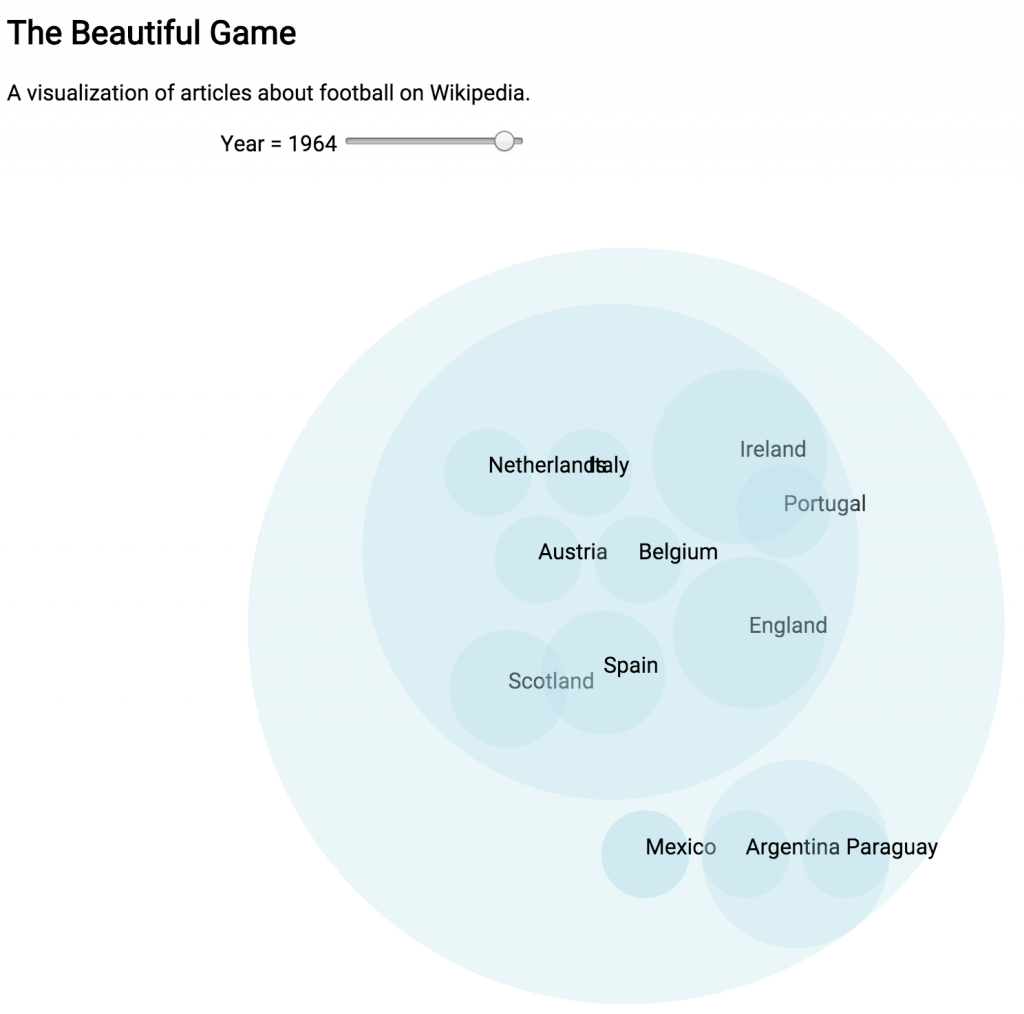
I realized that I wanted to see if I could find ways that our understanding of the world was limited, to find the edges of our knowing and understanding. To that end, I decided to explore the possibility of unseen imbalances and limitations on Wikipedia. My original proposal was to create a mapping of all the event articles that could be scrubbed through by year. I was hoping to uncover under-documented regions and time periods, but I didn’t really know what I was going to find. I was asking a question, rather than making something that I had tightly planned out.

The technical end of this project was an interesting challenge. I had to know know what kind of data was available and how it was organized to create the visualization, but I had to know what kind of data scheme was best for the visualization in order to process the data. The result was that I had to work both ends of the project at once, without having a completely clear idea of how they would join together. It was kind of like digging a tunnel from both ends and having faith that they would meet in the middle. My process ended up being watching d3.js tutorials, working through example exercises, and researching the Wikipedia API without having a strict final project design in mind. I trusted that the correct visualization would become clear as I worked through the technology.

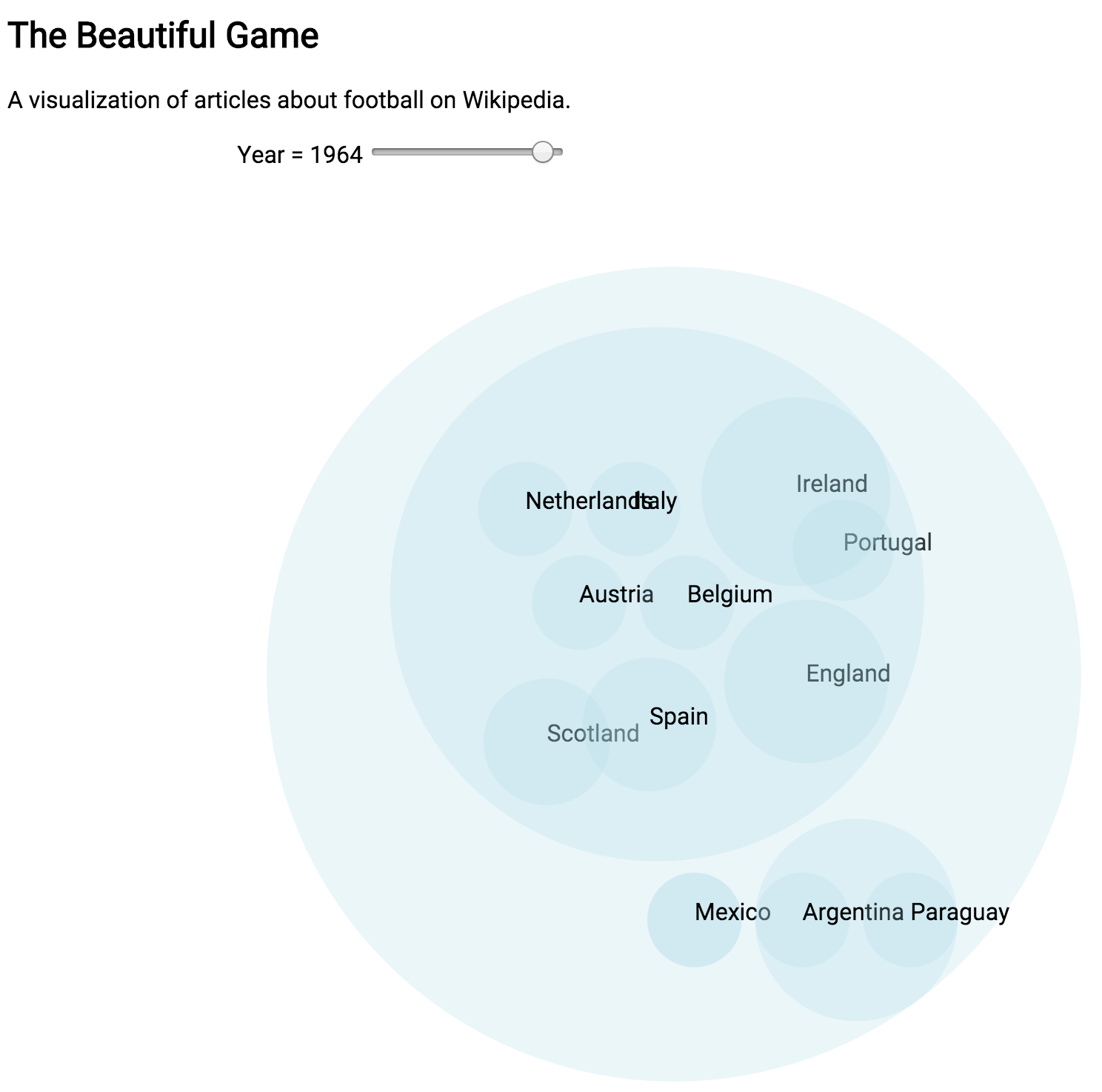
At a certain point I realized that I was going to have to scale back the dataset I was using for this project. Using all the history articles on Wikipedia is simply beyond the scope of my skills right now. I had to pick a slice of the data to use instead. There were a lot of options but I ended up going with soccer. I really liked this dataset because it was a manageable size, but also because I feel like it still encapsulates most of the original idea. Soccer a truly global sport with a long history. There’s also the sense that international rivalries that would have previously found an outlet in marital conflict can be settled on the soccer pitch.

Data

Wikipedia – My original desire was to create a visualization with live data using the Wikipedia API. It turns out that the wikipedia API is actually just the MediaWiki API, the wiki platform that Wikipedia uses, and is much better suited for gathering data about and manipulating the structure of Wikipedia, rather than reading its contents. (This awesome project for example).

Another option for getting the data straight from Wikipedia would be to scrape the site itself and create a custom dataset for the visualization. Many historical events have these great information boxes that summarize the event. Scraping the data out would get you everything you need to make a visualization. This approach is nice in that it would allow for complete customizability, but is bad in that it is extremely annoying. Scraping the data would not be that hard, the difficult part is that there is no information standardization on Wikipedia. Not all historical events have information boxes and there is a great deal of variation when they do exist. Scraping the data and putting it into a manageable form is really the kind of thing that you’d rather have someone else do for you. The good news is, someone already has

DBpedia & Wikidata.org – DBpedia and Wikidata.org are both projects that seek to take wikipedia contents and put it into a more searchable form. If you are looking for content from wikipedia for your application, using one of these is probably the way to go.

The problem that I ran into was that I had no idea how to query the data. Both projects use the SPARQL query language and store the data as RDF. Even after researching both SPARQL and RDF, I basically had no idea how to use either. Learning more about different query types seems like a great project for the future.

Static Data Sets – The easiest thing for me ended up being a static dataset released by DBpedia. The problem here was that the dataset was still absolutely huge; there were several I couldn’t even open. Also, after looking at them it became clear that the data would need a lot of cleanup. The location data was not all in the same format and would need to be normalized. I ended up doing a lot of this work manually in a spreadsheet and then using a pivot table to sort the data into a more useful form. Then I turned that information into json for the visualization.

Visualization

d3.js – I really wanted to learn d3.js. In many ways this project was created as an exercise to learn the technology. I did this mostly through the examples, documentation, and youtube tutorials. The technology is pretty straightforward, as long as you want to make something that they’ve already built. Deviating from what they’ve designed causes issues.

One difficulty I ran into with d3.js is that method chaining makes it difficult to debug. it’s hard to print something to the console to see if your data is being loaded correctly. Though, it seems like this is really something that will get better with more practice.

What’s Next

Learning how to read and update text & Getting better at manipulating datasets – This project really ended up being a data project rather than a visualization and it would have gone a lot faster if I could have done more of the data manipulation programmatically.  

Think more about design – This project didn’t leave a lot of time for the design and layout considerations, which is honestly what I was really interested in. Going back and polishing this up later is going to be a good exercise.

Learn more d3.js – There is a lot of easy functionality here, making more charts,graphs and learning about transitions and animations seems like it will be a good skill for making complex interactive visualizations.

Leave d3.js behind – Truthfully, d3.js is a little boring. There’s a ton you can do with it, but there’s so much more that’s out there. I’d really like to be able to make whatever I imagine and that requires more than one javascript library.

Go further with Wikipedia data – Wikipedia is really interesting and really comes back to the core of what interests me in general. There was an example on Wikidata.org on how to list French people who have entries on english Wikipeida, but not on frech Wikipedia. That seems really interesting and I want to find out what kind of stuff is out there. Using Wikipedia as a framework for examining what we know and how we know seems very fruitful.

Glow Blocks – Planning

IMG_3130


I went into the play testing for this project without doing any substantial planning for the project, or even a clear idea about how to achieve the effects I wanted technically. During the play testing Danny suggested that I could achieve most of what I wanted with an accelerometer, and I think that this is true. The basic interaction for this project is:

The accelerometer knows it is on the floor
1. A person stacks a block on top of another block
The accelerometer senses the change in the X-Axis
The LEDs change color according to the height, creating color gradient
2. A tower is knocked over
The accelerometer senses the change in the X-Axis
The LEDs change color according to the height, creating explosion and sparkle effect
3. The blocks are back on the floor
The accelerometer senses the change in the X-Axis
The LEDs chage color according to the height, resets to the base color
4. Repeat

With that in mind the components in each box will be:

  • MPU-6050 (Accelerometer + Gyro)
  • 6 Common Anode RGB LEDs
  • TLC5940 (16-Channel LED Driver)
  • ATmega328P (Microcontroller)
  • On/Off Switch
  • Button
  • Power (TBD)

The blocks themselves will be made of:

I’m sure that I will end up needing other components and materials as I test and prototype everything, but that list should be what’s at the heart of each box.

Something that won’t make it into this version, as it’s not central to the concept, but that I would love to add to a future version is the MRF24J40MA-I/RM (RF Transceiver Module). It would be a great way to let the boxes communicate with each other and other, as of yet unimagined, components.

My current build plan is:

Glow Box Schedule

But that is highly dependent on all the different component orders arriving in a timely manner. I think that one of the main challenges of this project, besides simply getting everything working, will be allowing enough time to make multiple blocks.


Glow Blocks – Play Testing

My original pitch for the P Comp final was “I want to smash things”. I was fed up with projects that were tied to laptops and other delicate technology or projections that have no corporeal presence. Instead, I wanted to make something that existed as an object on its own that required a fully physicality.

I considered a number of different ideas (including conductive smashables and foam bananas) but eventually settled on light up blocks that can be used to build a tower and then knocked down! I’m hoping to capture the childlike joy of building, then destroying.

For the play test I wanted to see if people would build a tower and then knock it over if I provided the blocks. I also wanted to use the opportunity as a quick materials test for the plastic boxes I’d sourced.

I wired up some LEDs to see how they would look inside the plastic boxes and to see how they would hold up to being thrown around.

My take-aways from the play testing were:

  • No one knocked the tower over on their own.
  • People generally wanted more interaction, wanted the blocks to do more or to have more of a construct around the interaction.
  • More people played with the blocks on the floor than expected.
  • If they change to the same color each time it gets boring.
  • Maybe they shouldn’t change color at all until they fall.
  • ITP people/ adults might treat things too delicately. (But people really liked it after they knew they could kick it)


Wikipedia Article Visualization – Proposal

My main challenge with this project has been that I knew that I wanted to make some kind of data visualization, but I did not have a strong idea of the data I wanted to visualize. Dano suggested in class that the main challenge for data-viz is often finding the question that you want to answer. I gave some thought to questions that interested me, what kind of visualizations I enjoy, and came up with a question I would like answered:

Is there an article imbalance on Wikipedia?

At the moment Wikipedia is the working authority on basically everything. But like any other source of information it has its biases and limits. I’d like to explore what those limits might be. To that end, I would like to make a cartogram showing the size of a country relative to how many english language history articles it has on Wikipedia. There would be a timeline slider, so you can see how different historical periods are represented.

I would have to create the dataset either using the Wikipedia API or by downloading the relevant sections as XML.

Inspiration Visualizations:

Interesting interactive cartogram: http://www.carbonmap.org/

Population Cartogram


Not a Cartogram

Questions:

Thoughts on showing information on a cartogram vs 

How important is it to include information from other languages?

Is D3.js the best way to make this visualization? Is there a good intro to D3?

Midterm Proposal

IMG_3082


After a whole bunch of brainstorming I’ve realized that the project that I’d really like to build is a small cabinet for the pong game I’ve been eking out. I kept trying to come up with ideas for something that’s more artistic and cool, but I kept coming back to this project. So, I guess the best thing to do is just embrace it.

So far the semester has felt like a whole bunch of bits and pieces. I think what really interests me about building this is bringing everything together and solidifying what I have learned in PComp and ICM so far.