Her Long Black Hair

It’s amazing how predictable the park is. Most of the non-permanent things and people guide described where exactly where they should be. Not just ice cream stands and such, but homeless people, an asian couple taking their wedding photos, and a gondolier.

It was disconcerting trying to parse the actual noises of the park from the ones in the soundwalk. I kept feeling like I was about to walk into someone or get hit by a bicycle. This seems like it’s a great way to take people to an ‘alternate’ reality, but that it disconnects them too much if the goal is to get them familiar with their surroundings.

The myth of Orpheus and Eurydice has never really resonated with me, but I think it’s time that I take another look.

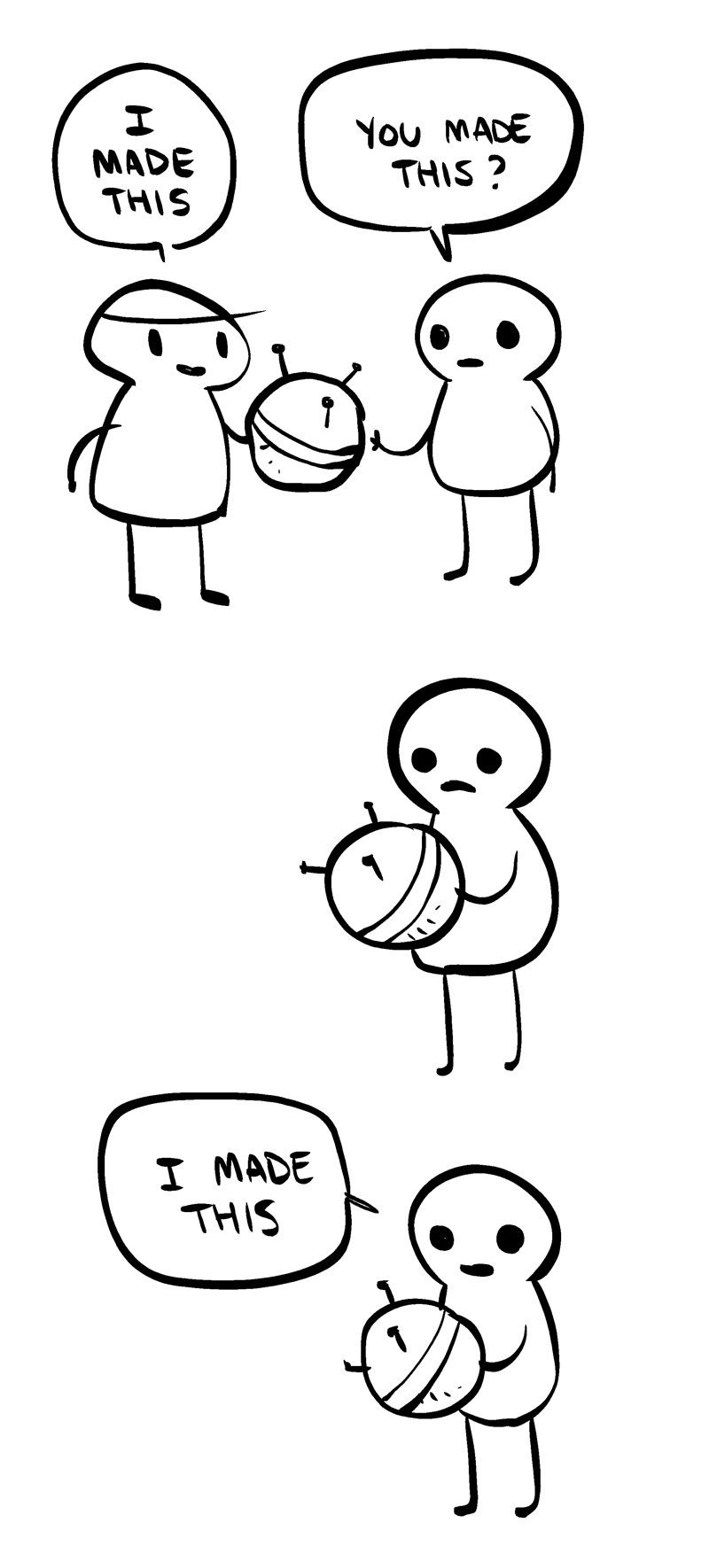
You made this? I made this.

I did not make this. From Nedroid.

These days it seems like it is a given that people can and should consume as much culture as possible, remixing and remaking it as they see fit. In fact, we now argue that this is what thinkers have always done. The only differences are that now not only can we do it better and faster, we can record every combination and recombination. I don’t really have any objection to this. I like the thought that ideas are free and can marry and mesh into glorious new forms. I like doing it myself; it’s a rush.

But it also unnerves me. I think that it is right for there to be some form of copyright on ideas and works of art for the life of the artist. The ideal creator would still be magnanimous with what they have created, but ultimately the control should stay with them while they are alive. This is a pretty middle of the road position, but it feels really radical in today’s world of infinite remixes, mashups, and viral videos.

Ultimately it keeps coming back to one main question:

Isn’t what I make mine?

Yes yes, everything is made of many influences, cherry picked from what came before. Maybe creators don’t even make anything, but are simply at the right crossroads of thought at the right time. It doesn’t matter. What I make is mine. Even if there are many like it, even if all I am doing is putting new words to an old melody. My works will always be tied to my own, singular experience of being alive in the world. That is part of their context and to strip them of that takes away some of their meaning.

Everything is made up of other things, other ideas. But the maker should still get some say in how the work is used, if only for a little while.

Sound Scavenger Hunt Top 3 Sounds

Stranger’s Dark Secret

We got this secret from the first person we approached. It was actually very easy to get someone to tell us a secret, maybe because it isn’t very dark or personal. Or maybe Tisch students just like over-sharing.


Dog Barking

There were a whole bunch of dogs in Washington Square park but none were barking. Eventually we went up to a guy with a dog and asked him if he could make his dog bark and he agreed to try.


Machine Sounds

I like these sounds because they are abstract. If I didn’t know what this was already, I don’t know that I could identify it. Can you? Highlight to see the answer: It’s the vent system in the wood shop.


On Interaction

Why interactivity?

Interactivity is high quality dynamic communication. Crawford describes this as a listening, thinking, speaking cycle with at least two actors and I like his definition. I especially like how this clearly sets interactions apart from reactions and participation, without diminishing reactions or participation. Each experience has its own value, but interactivity allows you to project yourself on the world which makes it the most satisfying.

Why physical interactivity?

Most of our interactions are physical interactions. We exist in the world as full corporeal beings and are cheating ourselves if we only use part of what we are. Physical interaction allows for the communication of more meaning, using more senses. There is a lot more out there than colored blobs on a screen even if we add words, pictures, and video into the mix. We don’t need to communicate the way computers do, they need to work more like people. This has been the trend from the very beginning, away from command line interactions closer and closer to how human bodies work.  

What makes for good physical interaction?

A good physical interaction engages the senses. It provokes an emotional response. Ideally for a tool interaction it should produce delight and satisfaction, for art there are a lot more options. You shouldn’t have to know how to do anything to have the interaction, as the designer should be using humans, or other animal, as the starting point and building on our existing forms and mental predilections. It should lead the participant to the point of discovery with little to no trouble.

Are there works from others that you would say are good examples of digital technology that are not interactive?

The work of artist, and ITP alum, Leo Villareal comes to mind. His work is, as far as I know, not interactive work. However, they are still captivating installations. This work allows for wonderful reflection. Instead of interacting the viewer is given the opportunity for introspection, which can also be a high quality emotional experience.

I was particularly struck by his installation in the National Gallery Concourse: 

Leo Villareal- Multiverse Go Pro from Gustavo Bernal on Vimeo.
 

ICM First Project – Bear Face

Screen Shot 2015-09-08 at 3.49.07 PM

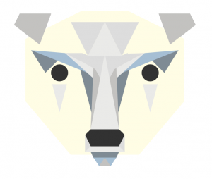
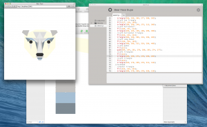
I decided to try and draw a low-poly style polar bear face for this project. The live page is here: http://itp.jscottdutcher.com/bear_face/

IMG_3013

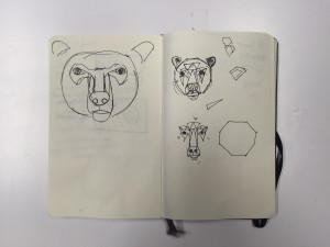
Preliminary sketches.

Screen Shot 2015-09-03 at 8.54.13 PM

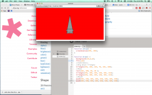
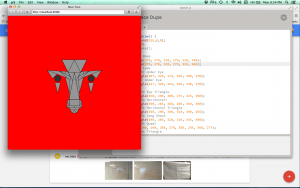
I started this drawing on a 640 X 300 point canvas, a size that seemed like a good idea at the time. Every shape was plotted relative to the top of the long ‘snout’ triangle, point (320, 70). Plotting was relatively easy, since the drawing is symmetrical. I used a bright read background while I was working so I could see where shapes weren’t lining up correctly.

Screen Shot 2015-09-07 at 6.06.27 PM


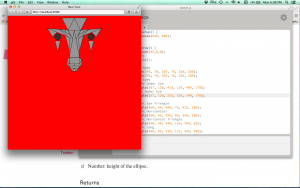
As I drew out the face it became clear that 640 X 300 was not the right canvas shape for this bear, so I upped it to 640 X 600.

Screen Shot 2015-09-07 at 8.54.33 PM


Then I added 200 points to all y-values to move the drawing down the page.

Screen Shot 2015-09-07 at 10.09.59 PM

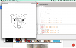
Outlines of all the shapes.

Screen Shot 2015-09-07 at 11.01.10 PM

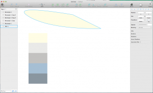
I picked the colors in Sketch, that way I could choose the colors using a color palette instead of messing with RGB values in the code.

Screen Shot 2015-09-07 at 11.07.53 PM

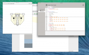
I put most of the colors in on a shape by shape basis. Grouping shapes by color and ‘colorizing’ the group would have been a way better way to go, but I did not think that far ahead this time. 

Screen Shot 2015-09-07 at 11.41.24 PMLastly I removed the stroke from the shapes and made minor adjustments to how the shapes lined up.